Last week I had a really strange project for company building apps using blockchain technology. The task was pretty simple — to write HTML and CSS for the components that were previously designed and... no JavaScript at all. The reason was understandable (and arguable) — security, without client scripts nobody can steal the private keys from the app using any kind of XSS or similar.
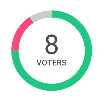
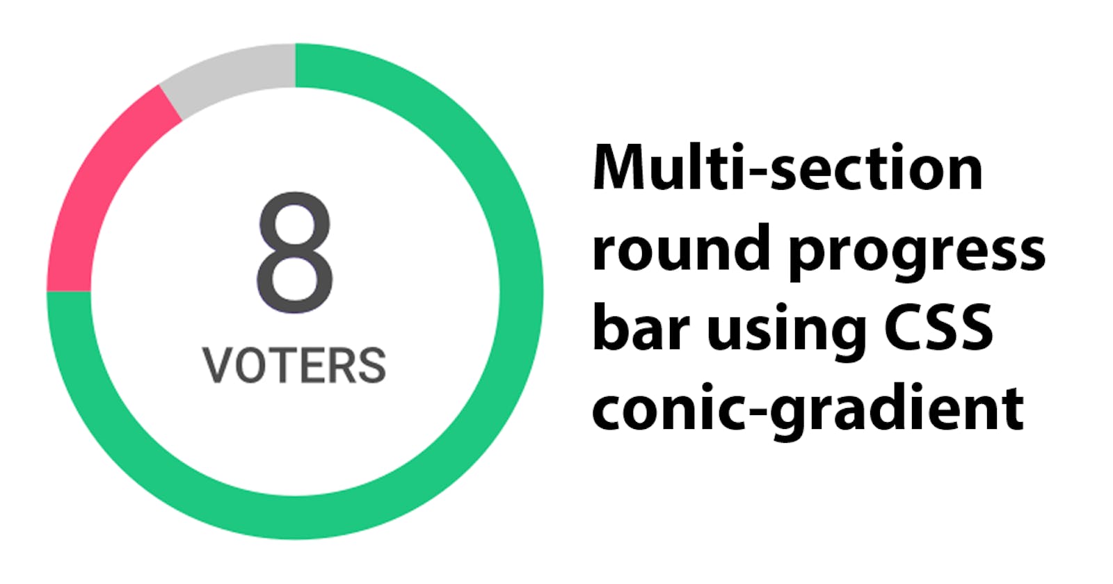
But then one of the components surprised me — a round progress bar with more than one color:

... and then I found out that I cannot use inline SVG too ;-))
My first thought was: “Oh, no, I don't want to use rounded borders and make classes for every percentage point possible.” And the second: “hm, maybe I can do that with radial-gradient somehow?” (no, I can't)
But there is another type of gradients, not supported even by Firefox for now: conic-gradient, but Chrome and Safari are doing great, so if you are targeting the latest versions of mobile OSes — you can use them. And if you need it for charts or progress bars like me, you can have a nice fallback to linear-gradient as well. And here's how I did it.
Using CSS Variables
To make it easy to fall back, we'll have to use the same data twice — in the conic-gradient and the linear-gradient. So let's keep it in the CSS variables if you are not targeting IE, of course. The code for my element looks like this:
<div class="chart" style="--approved: 75%; --rejected: 15%;"></div>
Since we have two colors: green (approved) and red (rejected), and gradients are great in handling data in %, then all we have to do is to write some CSS.
Linear-gradient as a graceful degradation
First comes the fallback — a classic linear-gradient with color-stops at the --approved and --approved + --rejected percentages:
.chart {
  width: 180px;
  height: 50px;
  background: linear-gradient(
    to right,
    green var(--approved),
    red var(--approved),
    red calc(var(--approved) + var(--rejected)),
    #ccc calc(var(--approved) + var(--rejected))
  );
}
Conical gradient for the browsers that supports it
And then the conical variant — checking for the support and then using the same color stops as before:
@supports (background: conic-gradient(#000, #000)) {
  .chart {
    width: 144px;
    height: 144px;
    padding: 18px;
    border-radius: 90px;
    background: conic-gradient(
      green var(--approved),
      red var(--approved),
      red calc(var(--approved) + var(--rejected)),
      #ccc calc(var(--approved) + var(--rejected))
    );
  }
  .chart--data {
    width: 144px;
    height: 144px;
    background: white;
    border-radius: 90px;
  }
}
The result
You can see, that additionally, I've put another element in the middle, to make the “hole” inside the progress, but you can play with the -webkit-mask properties if you need true transparency.
Hope that was helpful for somebody.
